BTW № 1: Stuff That Explains You Edition
I’m kicking off a new feature here: a roundup of things I’m reading, viewing, or generally into right now — loosely grouped around a theme. Since I’m getting back into writing here, I want to be a good web citizen and add to the link party I’ve been enjoying from folks like Naz Hamid, Dan Cederholm, and Scott Boms.
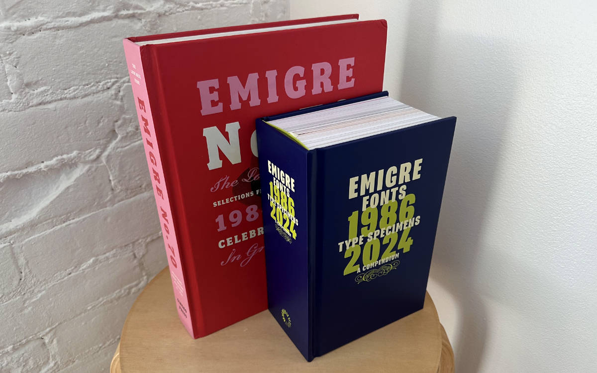
📚 Emigre No. 70: The Look Back Issue, now in PDF
I remember being in design school in the late ’90s when an instructor showed me an issue of Emigre Magazine. It was full of idiosyncratic, postmodern typography. Flavors of photocopier grit, collage, deconstruction, asymmetrical layouts — like punk rock beamed through QuarkXPress. As a new convert to graphic design, it felt like a secret transmission from another world. Messy, radical, opinionated, and totally electrifying.
Back then you could snail mail Emigre a letter asking to be added to their mailing list, and they would send you issues for free. I can’t remember if it was a student-only thing, but I certainly mentioned that I was a student in the hopes they wouldn’t get wise to who was getting the better end of that deal. Granted, over the years I’ve licensed a lot of Emigre fonts, and that was surely one of the magazine's goal: to showcase fonts and get people to purchase them.
Incredible inspiration, blasted straight to my mailbox, for free?! I pored over every page. Emigre was so formative in my early designer days. They were making fonts, designing wild magazines, and publishing essays that questioned what design was even for.
About 15 years ago for issue 70, they compiled every issue from 1984–2009 into a doorstop of a book. The physical edition is out of print, but you can pick up a PDF edition for only $5. It feels like I’m paying back a little of that free inspiration and postage they spent on me all those years ago.
Also worth a look: Letterform Archive’s recent release, Emigre Fonts: Type Specimens, 1986–2024. Smaller in stature, but thicker in pages and years.
🐦 They Might Be Giants interview
TMBG was one of the first bands I got into as I started discovering music, and they’ve stuck with me ever since. Their songs are stitched into the fabric of my life, and can instantly take me back to specific times and places.
I’ve even been lucky enough to cross paths with the Johns a couple of times: first, interviewing them for an entertainment magazine where I interned during college, and years later, designing a website for them when I lived in Brooklyn.
The AV Club did a two-part retrospective interview with them for their Set List series, using specific songs as entry points to talk through their whole career.
🫥 Design burnout and disillusionment
Elizabeth Goodspeed is back with another great article — this time digging into the dread hanging over the design industry, and the ways we try to cope. It’s full of healthy straight talk and introspection. On career growth:
And the longer you stick around, the more disorienting the gap becomes – especially as you rise in seniority. You start doing less actual design and more yapping: pitching to stakeholders, writing brand strategy decks, performing taste. Less craft, more optics; less idealism, more cynicism.
And on trying to exist as a designer without losing yourself:
The line between optimism and pessimism is increasingly blurred; designers are ironic about being sincere, sincere about being ironic, suspicious of optimism, but also wary of coming off as too cynical (or, sad). What’s being performed, more than anything, is ambivalence: the most protective emotional position in a profession that demands passion but punishes vulnerability. When the stakes are this personal, forced indifference can feel like the only safe response.
I see myself in a lot of this and I don’t like it! But later, some good advice:
If the industry no longer offers security, prestige, or even clout, then who is all this self-styling for? Why not do the thing that feels worthwhile, and be honest about how much it matters to us? As Mira Joyce puts it, “Caring deeply and openly about your craft shouldn’t feel embarrassing. It feels necessary to me.”
Trying to care more, not less.
✏️ Type designers’ sketchbooks
Sketchbooks continue to be one of the best inventions ever. Libbie Bischoff asked a bunch of her type design friends to share pages from their sketchbooks, and the results are incredible. Take a peek inside the brains of folks like Joanna Malinis, Lynne Yun (Space Type Co), James Edmondson (OH no Type Co), and more.
Libbie is the designer behind Type du Nord, a fantastic independent type foundry making awesome faces like the recently released Yolker. She also teaches at Type Electives where I’ve had the pleasure of taking a couple of her workshops, including one last fall that helped me push Citywide across the finish line. Her work and newsletter are well worth your time!
Loose Ends
- You Deserve a Tech Union, reprise: Ethan just released an updated design for his latest book, and it’s a beaut.
- RIP, Ottmar: Doug Wilson tracks down Ottmar Mergenthaler’s death certificate while pulling on all the threads for his upcoming Linotype book.
- Ultramega: A new typeface by Rachel Kriebel from JTD Type, a charming revival of a bootleg Futura-esque design from Russia. Don’t miss the interview with Rachel too.
- Ditch your smartphone? The idea of a phone that’s mostly just a phone is starting to sound real good.
- ← Prev Once Again From the Top
- Next → Funsizing