BTW № 2: Letterforms Edition
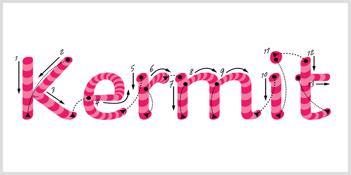
✍️ Kermit, a typeface for kids
A new type family from Underware in partnership with Microsoft geared towards helping kids learn to read. It strikes a smart balance of legibility, playfulness, and variability. They even created a variable “writable” version of Kermit that can interpolate its shapes to mimic the motion of the letterforms being written!
I have a love/hate relationship with handwritten style fonts. They usually feel limited or contrived, like too much of the typography is pre-baked. I sour on them as soon as I see an identical repeating letterform, the veil drops and the illusion is ruined. But Underware are probably the best in the biz on these kinds of fonts: Scribo, Bello, Liza, and more. Kermit contains tons of alternates and variability, the illusion is clean and whole. And bringing it to Office? Let’s put Comic Sans to bed forever. Don’t skip the in-depth notes around Kermit’s design and how it might be able to help those with dyslexia learning to read too.
✉️ Behind the Scenes with Licko & VanderLans
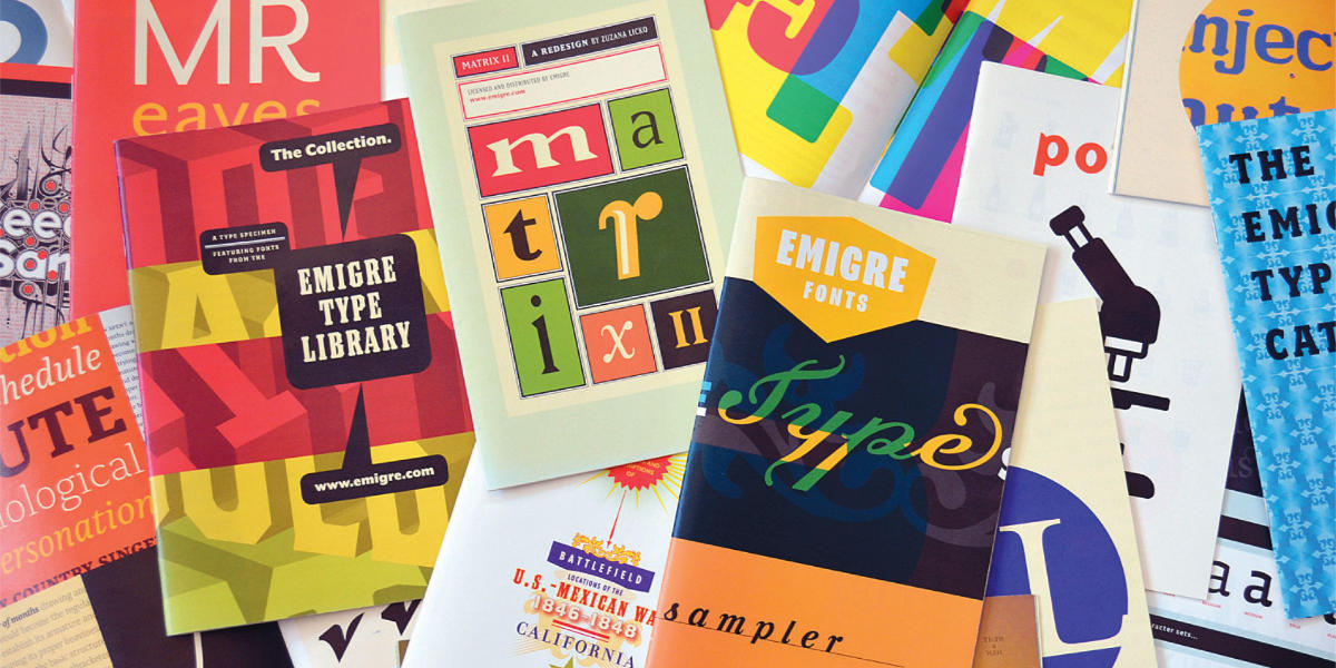
Following up on the last BTW’s mention of Emigre, Stephen Coles got to interview Zuzana Licko and Rudy VanderLans. Loads of great tidbits like Zuzana’s original proofing markups and details on how much they spent on those mailings in the ’90s. Wild that they recouped the costs and more! Different times:
Licko: By the mid-nineties, our mailing list was reaching upward of 40,000 to 50,000 potential customers. So we would mail out these promotional materials, be it a specimen booklet, a poster, or an issue of Emigre, to the entire list, free of charge. This would run upward of $30,000 to $40,000 per mailing. Each time we did this, it seemed like a lot of money, but we would usually recoup those costs and then some.
🤖 Are Em Dashes Really a Sign of AI Writing?
Apparently AI generated text is rife with em dashes. Sorry, I use em dashes a lot and will not cede this to the bots. I probably overuse them, but will now think of it as a badge of my own human imperfection. A cheatsheet: option + hyphen for an en dash, option + shift + hyphen for an em dash.
🕰️ Poltik
A new typeface from TypeTogether by Patrycja Walczak, the 2023 Gerard Unger Scholarship winner. Poltik was inspired by the numerals on a 1970s clock design Patrycja found in her grandfather’s drawer. Its text styles are warm and a little quirky in Light and Regular, but get really expressive as it gets bolder. Then the Display styles just hit you with retro goodness.
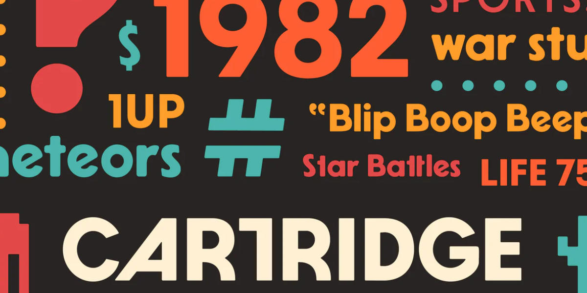
🕹️ Cartridge 3
A big update to Dan Cederholm’s Cartridge type family, now with 5 weights across both Regular and Soft styles. Plus new alternate letterforms, revised kerning, and lots of under-the-hood improvements.
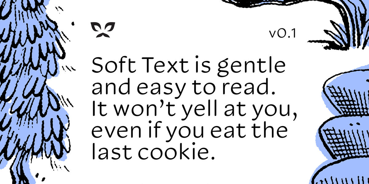
🦋 Soft Text
A new in-progress family by Kyle Letendre (Soft Type) at Future Fonts. I love the gentle contrast here, it’s a beautifully laid-back design. And $35 as an introductory price is a steal. More styles and weights on the way!
Loose Ends
- The Ohno Book, A Serious Guide to Irreverent Type Design: This promises to be a great read with insight from James Edmondson on his type design process.
- Yes to Kagi: I’ve been using Kagi search for two months now and am hooked on having useful, AI-free search results.
- Line height units: I totally missed when these got added to browsers, but they look super useful for typesetting.
- Webrings are back! I love this and totally want to get on board.
- Ryan Coogler on film aspect ratios: It’s always a treat to hear an expert geek out on something technical. Also, Sinners is great. You should see it.
- Alphabet in Motion teaser: Kelli Anderson made an activation video (to tease bookstores) of her upcoming pop-up book on how letters got their shapes. Unsurprisingly, it looks bananas, Kelli consistently brings so much artistry to everything she does.
- ← Prev Funsizing
- Next → Large Language Muddle